The context
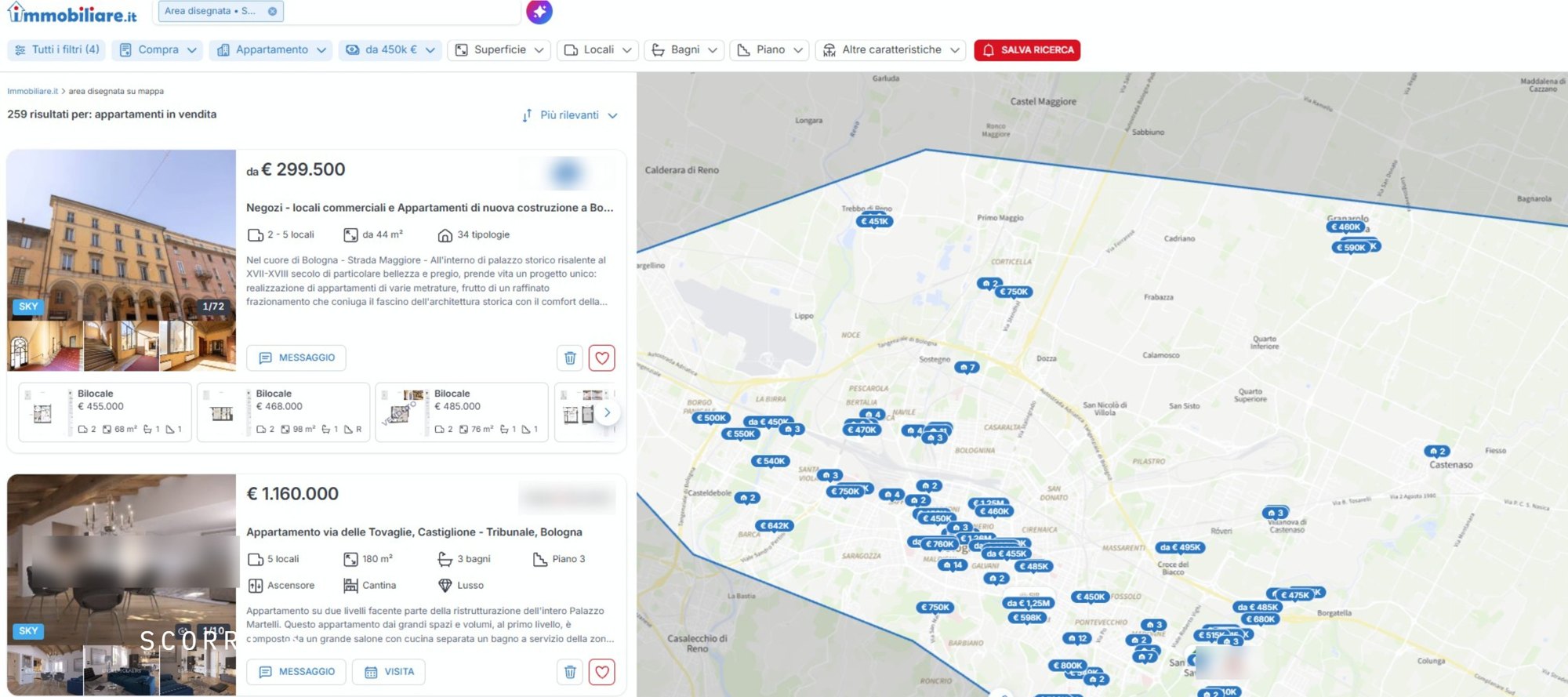
The first image is almost always a listing portal
For most families and private investors, the first contact with a new-build development happens neither on site nor on the project website, but in a list of ads. Immobiliare.it reports over ten million unique visitors a month on its site, plus another three million on the app. In that space every project is represented by a single image, a price and two lines of text, and competes with dozens of other listings in the same scroll.
Search time makes it worse: the portal estimates that buying a home takes six to nine months on average, so a buyer meets the same cover many times before ever clicking on it. That is why we decided to look at exactly that image, and to do it systematically.
Anyone selling off-plan knows it: for months the development is its listing, one cover in a list next to dozens of others. Following our clients' construction sites we noticed recurring patterns in how projects are positioned on the portals, and a growing use of AI-generated images. We decided to measure them.
10.5 m
unique visitors a month on the Immobiliare.it website, plus 3.1 m on the app
6–9 months
the average length of a home search, according to the portal
10 / 100
covers in which the project's brand is recognisable
The method
One hundred listings, three variables
We took the first fifty new-build listings for Milan and the first fifty for Bologna, suburbs included, in the default relevance order the portal proposes, which is what someone searching without filters actually sees. For each listing we recorded three things.
- 01
The kind of cover
What type of image was chosen to represent the project in the list: render, photo, graphic, construction-site photo.
- 02
The project's identity
Whether the cover tells you which development it is, with a name, a logo or a recognisable graphic element, or whether it could be any building.
- 03
Who publishes
Large real estate advisor, builder or developer selling directly, local agency.
Sample: 100 new-build listings, 50 Milan and 50 Bologna, suburbs included, Immobiliare.it relevance order. Survey taken in September 2026.
The results
Five kinds of cover
The hundred images fall quite naturally into five families. We describe them in the order they appear most often in Milan.
- 01
The glossy cover
A quality render, a considered framing, consistent light, often with the project name. It is the cover you expect from an operation with a communication budget, and indeed it almost always comes from the large advisors.
- 02
The dated style
Renders or photomontages with the look of ten or fifteen years ago: saturated skies, repeated vegetation, forced perspectives. They say the project exists, not that it is worth choosing.
- 03
AI slop
Images generated or heavily retouched with artificial intelligence tools, recognisable by their inconsistencies: windows that do not match the floors, undefined materials, details that change from one image to the next. They look polished at first glance, but they do not describe the building that will be built.
- 04
The promotion
Graphics with prices, discount percentages, «last units» or the agency logo in the foreground. The image of the project, when there is one, is a detail.
- 05
The construction site
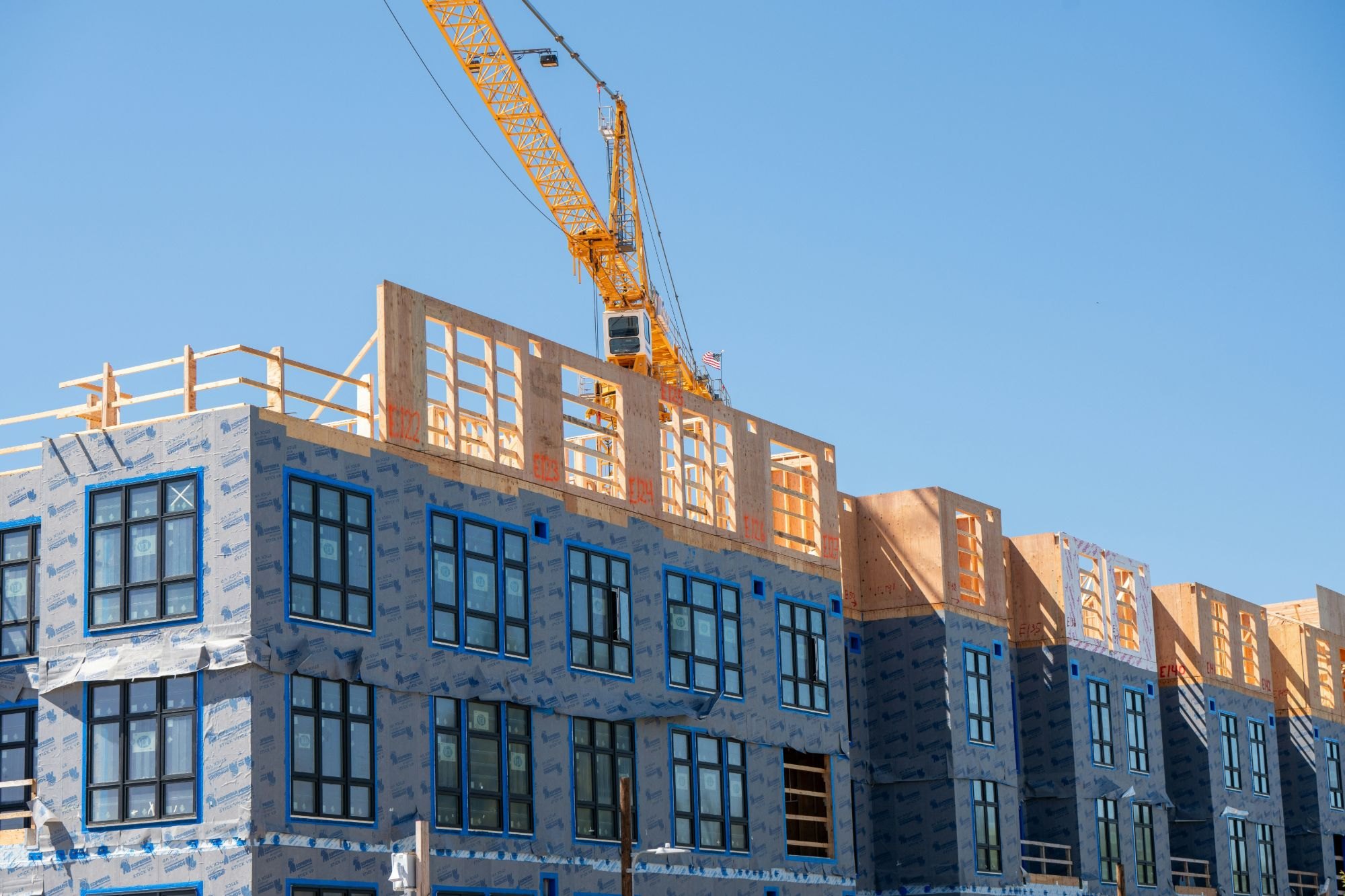
A photograph of the works in progress, with scaffolding and cranes. It is honest, but it is the only case where the buyer has to imagine the result alone.
Percentages of the 50 listings per city. Emme Works research, September 2026.
Who publishes
Quality follows the sales channel, not the developer
The figure that best explains the differences between the two cities is who signs the listing. In Milan, out of fifty listings, seventeen come from large advisors, one from a builder selling directly and thirty-two from smaller agencies. In Bologna the large advisors are four, the builders selling directly five and the agencies forty-one.
Cross-referencing the kind of cover with the kind of advertiser, two clear regularities emerge. First: one hundred per cent of the glossy covers are published by large advisors. Second: all five Bologna builders selling directly use dated-style images. In other words, the quality of the cover depends on the sales channel chosen, not on who designed and financed the development. A good project entrusted to a local agency appears in the list with the same image as a mediocre one.
17 · 1 · 32
Milan: large advisors · builders selling directly · smaller agencies
4 · 5 · 41
Bologna: large advisors · builders selling directly · smaller agencies
Artificial intelligence
22% of the Milan covers and 10% of the Bologna ones look like images generated or retouched with AI. The problem is not the tool but the direction: the image has to describe the building that will be built, with its materials and its proportions, otherwise it feeds expectations the construction site will not meet.
The brand
Ten projects out of a hundred have a recognisable name
The third variable concerns identity. In only ten covers out of a hundred is the project recognisable as such: three in Milan and seven in Bologna. In the other ninety cases the listing could refer to any building in the same area. The naming, when there is one, almost always follows the same scheme, the street name followed by «Living» or a similar word, hard to remember and hard to search for.
The point is not aesthetic. Someone searching for six or nine months comes back to the list dozens of times: a project with a recognisable name and image is memorised, looked up again, compared with the others. An anonymous project is assessed from scratch every time, on price per square metre.
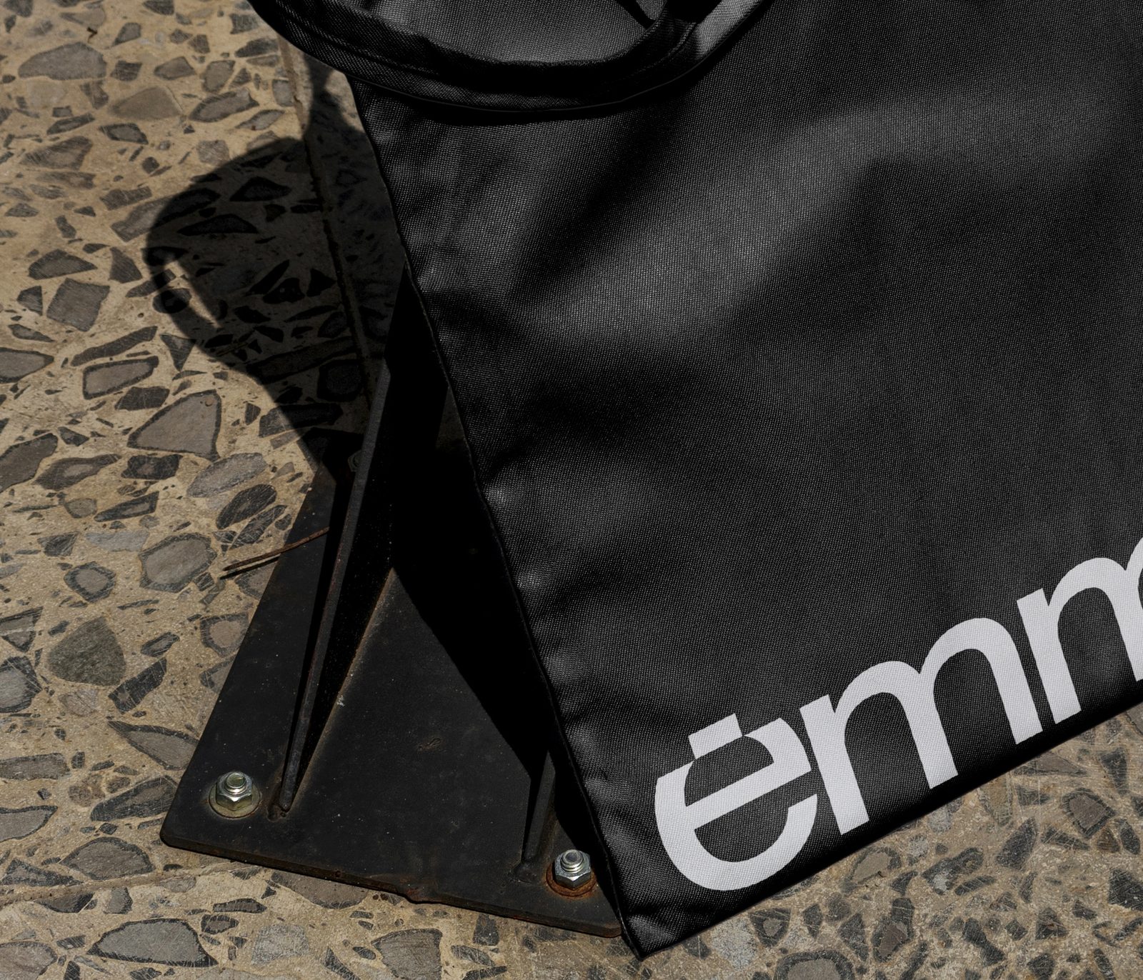
Naming, logo and visual identity are often created for the brochure and the website, and stop there. A project with a structured identity carries it across every touchpoint, from the site hoarding to social media, down to the shopper handed over in the sales suite.
On the listing cover, however, it is almost always missing. If the developer did not choose the opening image, someone else did.
3 / 50
Milan covers with a recognisable project brand
7 / 50
Bologna covers with a recognisable project brand
Our approach
Art direction and integrated communication
The cover is the last link in a chain. When the project has a defined identity and a well-crafted 3D model, the image for the portal is a consistent extract of a wider system, not a file sent to the agency the day before publication. That is why we work on a development's communication as a whole, with a single direction that holds the materials together.
- 01
Branding and naming
A name that is remembered and a mark that is recognised in the list and on the hoarding.
- 02
Web design and project websites
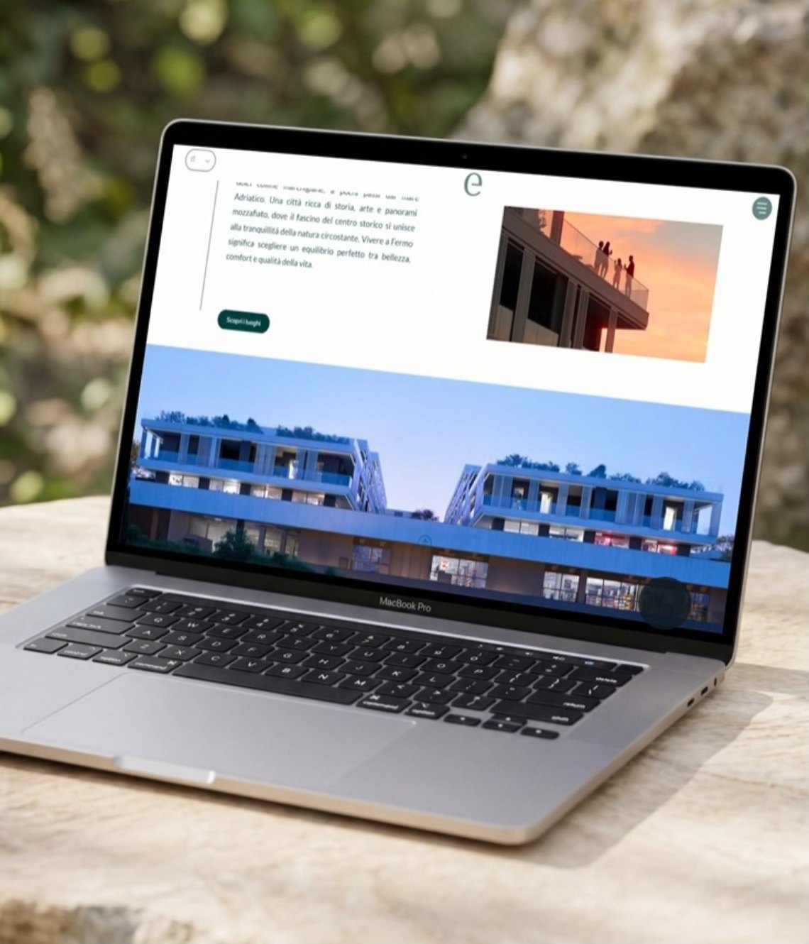
The listing's destination: a page that answers the questions before the visit.
- 03
3D configurators and unit selectors
Choosing the unit from the model, with floors, orientations and finishes.
- 04
Still images and CGI
Images that describe the building that will be built, materials included.
- 05
Video and animation
From the same 3D base, for social media, website and sales suite.
- 06
Virtual tours
Furnished interiors you can explore before they exist.
- 07
Social media
Formats and editorial plans consistent with everything else.
- 08
Print-ready materials
Brochures, site hoardings, sales books.